

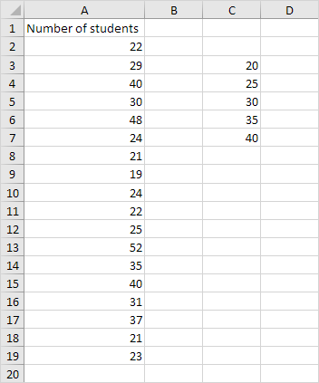
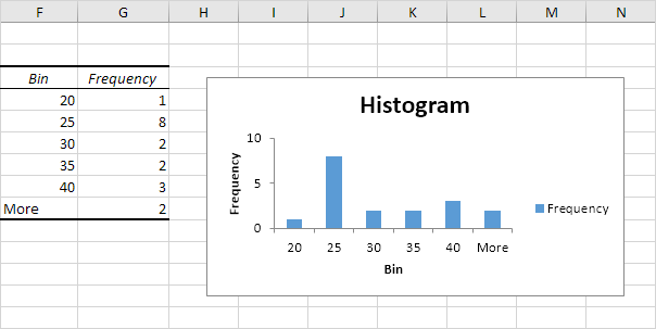
1. First, enter the bin numbers (upper levels) in the range C3:C7.
2. On the Data tab, in the Analysis group, click Data Analysis.
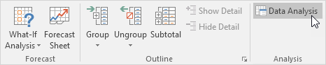
Note: can't find the Data Analysis button? Click here to load the Analysis ToolPak add-in.
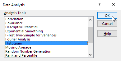
3. Select Histogram and click OK.
4. Select the range A2:A19.
5. Click in the Bin Range box and select the range C3:C7.
6. Click the Output Range option button, click in the Output Range box and select cell F3.
7. Check Chart Output.
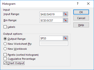
8. Click OK.
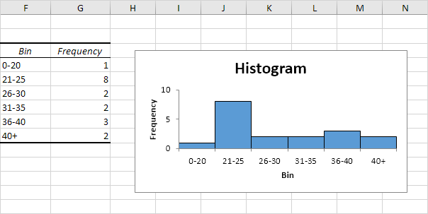
9. Click the legend on the right side and press Delete.
10. Properly label your bins.
11. To remove the space between the bars, right click a bar, click Format Data Series and change the Gap Width to 0%.
12. To add borders, right click a bar, click Format Data Series, click the Fill & Line icon, click Border and select a color.
Result:
 .
.