To change the chart type:
If you find that your data isn't well suited to a certain chart, it's easy to switch to a new chart type. In our example, we'll change our chart from a column chart to a line chart.
Select the chart you want to change. The Design tab will appear on the right side of the Ribbon.

From the Design tab, click the Change Chart Type command.

A dialog box will appear. Select the desired chart type, then click OK.

The new chart type will appear.

To switch row and column data:
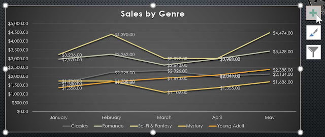
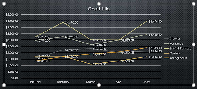
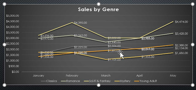
Sometimes you may want to change the way charts group your data. For example, in the chart below the book sales data is grouped by genre, with lines for each month. However, we could switch the rows and columns so the chart will group the data by month, with lines for each genre. In both cases, the chart contains the same data; it's just organized differently.
Select the chart you want to modify. The Design tab will appear.
From the Design tab, select the Edit Data command in the Data group.
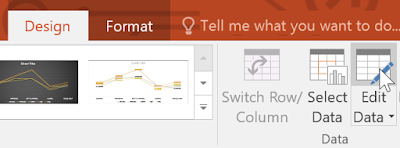
Click the chart again, then select the Switch Row/Column command in the Data group.
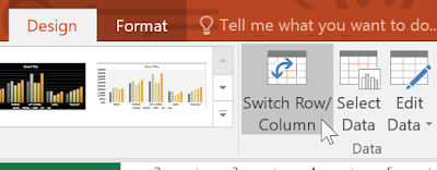
The rows and columns will be switched. In our example, the data is now grouped by month, with lines for each genre.

We've noticed that when numerical data has been entered in the first column of the spreadsheet, switching rows and columns may cause unexpected results. One solution is to type an apostrophe before each number, which tells the spreadsheet to format it as text instead of a numerical value. For example, the year 2016 would be entered as '2016.
To change the chart layout:
Predefined chart layouts allow you to modify chart elements—including chart titles, legends, and data labels—to make your chart easier to read.
Select the chart you want to modify. The Design tab will appear.
From the Design tab, click the Quick Layout command.
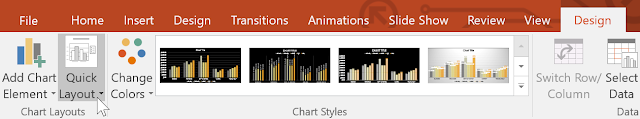
Select the desired predefined layout from the menu that appears.
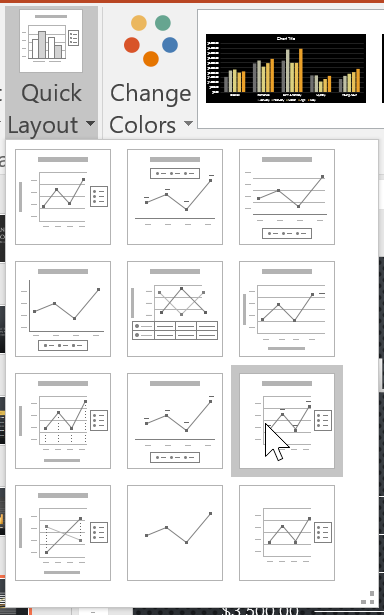
The chart will update to reflect the new layout.
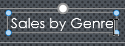
To change a chart element (such as the chart title), click the element and begin typing.
To change the chart style:
Chart styles allow you to quickly modify the look and feel of your chart.
Select the chart you want to modify. The Design tab will appear.
From the Design tab, click the More drop-down arrow in the Chart Styles group.
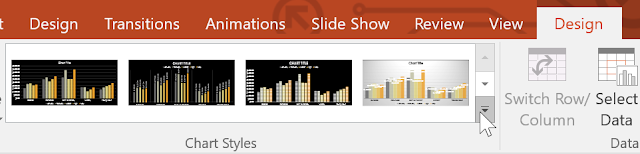
Select the desired style from the menu that appears.
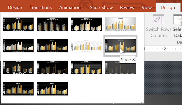
The chart will appear in the selected style.
You can also use the chart formatting shortcut buttons to quickly add chart elements, change the chart style, and filter the chart data.