DW Faisalabad New Version

DW Faisalabad New Version
Please Jump to New Version
Showing posts with label Charts. Show all posts

Wednesday, 5 July 2017

Pareto Chart

This example teaches you how to create a Pareto Chart in Excel. The Pareto principle states that, for many events, roughly 80% of the effects come from 20% of the causes. In this example, we will see that roughly 80% of the complaints come from 20% of the complaint types.


To create a Pareto chart in Excel 2016, execute the following steps.

1. Select the range A3:B13.

2. On the Insert tab, in the Charts group, click the Histogram symbol.


3. Click Pareto.


Result:


Note: a Pareto chart combines a column chart and a line graph.

4. Enter a chart title.

5. Click the + button on the right side of the chart and click the check box next to Data Labels.


Result:


Conclusion: the orange Pareto line shows that (789 + 621) / 1722 ≈ 80% of the complaints come from 2 out of 10 = 20% of the complaint types (Overpriced and Small portions). In other words: the Pareto principle applies..
Read More »

Gantt Chart

Excel does not offer Gantt as chart type, but it's easy to create a Gantt chart by customizing the stacked bar chart type. Below you can find our Gantt chart data.


To create a Gantt chart, execute the following steps.

1. Select the range A3:C11.

2. On the Insert tab, in the Charts group, click the Column symbol.


3. Click Stacked Bar.


Result:


4. Enter a title by clicking on Chart Title. For example, Build a House.

5. Click the legend at the bottom and press Delete.

6. The tasks (Foundation, Walls, etc.) are in reverse order. Right click the tasks on the chart, click Format Axis and check 'Categories in reverse order'.


Result:


7. Right click the blue bars, click Format Data Series, Fill & Line icon, Fill, No fill.


8. Dates and times are stored as numbers in Excel and count the number of days since January 0, 1900. 1-jun-2017 (start) is the same as 42887. 15-jul-2017 (end) is the same as 42931. Right click the dates on the chart, click Format Axis and fix the minimum bound to 42887, maximum bound to 42931 and Major unit to 7.


Result. A Gantt chart in Excel.


Note that the plumbing and electrical work can be executed simultaneously..
Read More »

Thermometer Chart

This example teaches you how to create a thermometer chart in Excel. A thermometer chart shows you how much of a goal has been achieved.


To create a thermometer chart, execute the following steps.

1. Select cell B16.

Note: adjacent cells should be empty.

2. On the Insert tab, in the Charts group, click the Column symbol.


3. Click Clustered Column.


Result:


Further customize the chart.

4. Remove the chart tile and the horizontal axis.

5. Right click the blue bar, click Format Data Series and change the Gap Width to 0%.


6. Change the width of the chart.

7. Right click the percentages on the chart, click Format Axis, fix the minimum bound to 0, the maximum bound to 1 and set the Major tick mark type to Outside.


Result:

.
Read More »

Gauge Chart

A gauge chart (or speedometer chart) combines a Doughnut chart and a Pie chart in a single chart. If you are in a hurry, simply download the Excel file.

This is what the spreadsheet looks like.


To create a gauge chart, execute the following steps.

1. Select the range H2:I6.

Note: the Donut series has 4 data points and the Pie series has 3 data points.

2. On the Insert tab, in the Charts group, click the Combo symbol.


3. Click Create Custom Combo Chart.


The Insert Chart dialog box appears.

4. For the Donut series, choose Doughnut (fourth option under Pie) as the chart type.

5. For the Pie series, choose Pie as the chart type.

6. Plot the Pie series on the secondary axis.


7. Click OK.

8. Remove the chart title and the legend.

9. Select the chart. On the Format tab, in the Current Selection group, select the Pie series.


10. On the Format tab, in the Current Selection group, click Format Selection and change the angle of the first slice to 270 degrees.

11. Use the ← and → keys to select a single data point. On the Format tab, in the Shape Styles group, change the Shape Fill of each point. Point 1 = No Fill, point 2 = black and point 3 = No Fill.

Result:


Explanation: the Pie chart is nothing more than a transparent slice of 75 points, a black slice of 1 point (the needle) and a transparent slice of 124 points.

12. Repeat steps 9 to 11 for the Donut series. Point 1 = red, point 2 = yellow, point 3 = green and point 4 = No Fill.

Result:


13. Select the chart. On the Format tab, in the Current Selection group, select the Chart Area. In the Shape Styles group, change the Shape Fill to No fill and the Shape Outline to No Outline.

14. Use the Spin Button to change the value in cell I3 from 75 to 76. The Pie chart changes to a transparent slice of 76 points, a black slice of 1 point (the needle), and a transparent slice of 200 - 1 - 76 = 123 points. The formula in cell I5 ensures that the 3 slices sum up to 200 points.

.
Read More »

Combination Chart

A combination chart is a chart that combines two or more chart types in a single chart.

To create a combination chart, execute the following steps.

1. Select the range A1:C13.


2. On the Insert tab, in the Charts group, click the Combo symbol.


3. Click Create Custom Combo Chart.


The Insert Chart dialog box appears.

4. For the Rainy Days series, choose Clustered Column as the chart type.

5. For the Profit series, choose Line as the chart type.

6. Plot the Profit series on the secondary axis.


7. Click OK.

Result:

.
Read More »

Sparklines

Insert Sparklines  |  Customize Sparklines

Sparklines in Excel are graphs that fit in one cell and give you information about the data.

Insert Sparklines

To insert sparklines, execute the following steps.

1. Select the cells where you want the sparklines to appear. In this example, we select the range G2:G4.


2. On the Insert tab, in the Sparklines group, click Line.


3. Click in the Data Range box and select the range A2:F4.


4. Click OK.

Result:


5. Change the value of cell F3 to 0.

Result. Excel automatically updates the sparkline.


Customize Sparklines

To customize sparklines, execute the following steps.

1. Select the sparklines.

2. On the Design tab, in the Show group, check High Point and Low point.


Result:


3. On the Design tab, in the Type group, click Column.


Result:


To delete a sparkline, execute the following steps.

4. Select 1 or more sparklines.

5. On the Design tab, in the Group group, click Clear.

.
Read More »

Error Bars

This example teaches you how to add error bars to a chart in Excel.

1. Select the chart.

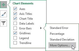
2. Click the + button on the right side of the chart, click the arrow next to Error Bars and then click More Options.


Notice the shortcuts to quickly display error bars using the Standard Error, a percentage value of 5% or 1 standard deviation.

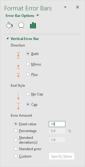
The Format Error Bars pane appears.

3. Choose a Direction. Click Both.

4. Choose an End Style. Click Cap.

5. Click Fixed value and enter the value 10.


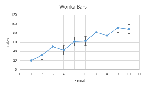
Result:


Note: if you add error bars to a scatter chart, Excel also adds horizontal error bars. In this example, these error bars have been removed..
Read More »

Trendline

This example teaches you how to add a trendline to a chart in Excel.

1. Select the chart.

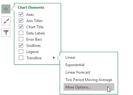
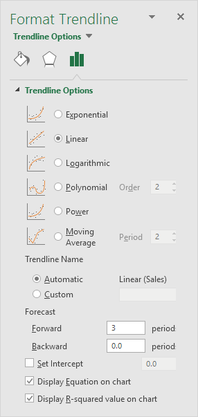
2. Click the + button on the right side of the chart, click the arrow next to Trendline and then click More Options.


The Format Trendline pane appears.

3. Choose a Trend/Regression type. Click Linear.

4. Specify the number of periods to include in the forecast. Type 3 in the Forward box.

5. Check "Display Equation on chart" and "Display R-squared value on chart".


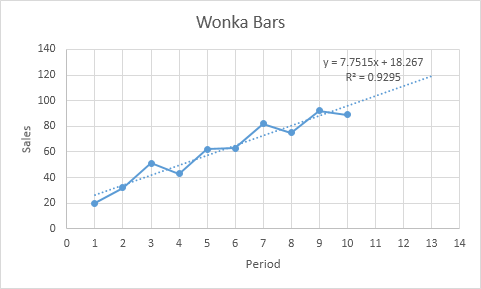
Result:


Explanation: Excel uses the method of least squares to find a line that best fits the points. The R-squared value equals 0.9295, which is a good fit. The closer to 1, the better the line fits the data. The trendline predicts 120 sold wonka bars in period 13. You can verify this by using the equation. y = 7.7515 * 13 + 18.267 = 119.0365..
Read More »